
The good: Classic yet functional design; thumb-friendly controls; Bluetooth stereo; FM radio; external memory card slot.
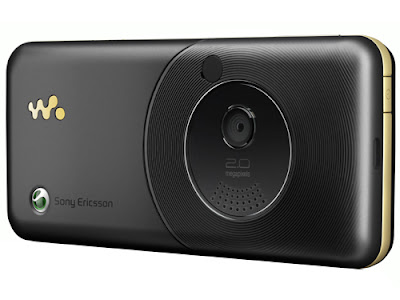
The bad: Not quadband; no autofocus or built-in photolight.
The bottom line: The W660i isn't the most advanced handset. However, its decent all-round feature set, straightforward design and user interface are likely to attract the mainstream crowd.
Scroll Down for more Pictures...
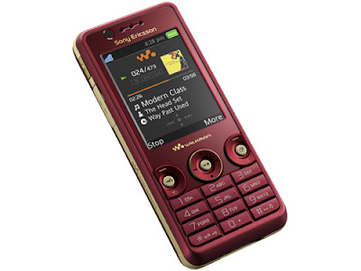
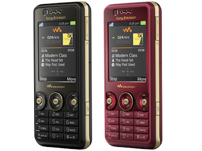
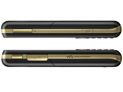
The Sony Ericsson W660i belongs to the company's Walkman lineup, though the handset focuses a little more on design compared with its siblings. The phone is currently available in Record Black and Rose Red. One thing to note is that the actual color of the latter is about two shades lighter than what it looks like from the picture.
DesignThis is where the W660i aces the first lesson on design: To build a phone that's usable. It's that simple, but increasingly rare today when manufacturers try to cram all the latest features into every nook and cranny of the handset. You won't find any frills on this Sony Ericsson. There's none of the fancy swiveling tricks or groovy sliders you see on other mobile devices. But that's also why we really like this handset.
The numeric keypad is very similar to the Cyber-shot K800i, albeit with more groove which makes it easier to type on. There's a saying that if it ain't broke, don't fix it. Although the Swedish-Japanese company has produced handsets like this with a user-friendly keypad, it's bewildering to find it heading the other direction with tiny pegs as buttons on the K810i and the upcoming K850i. Whatever was Sony Ericsson thinking? Like the W610i, the main controls on the W660i are laid out in three circles, each with a center button that's disjoined from the disc.
Although it may seem congested at first, the keys are actually very usable and thumb-friendly.
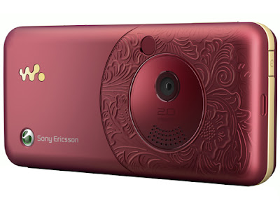
We had one problem initially and that's mistaking the center play/stop button as a joystick. The W660i is also a little flashier compared with its siblings. While we like the pastel gold lining running the circumference of the handset, some of our friends didn't share the same sentiments. The top half on the back of the phone also has some motifs etched onto it. There's no practical aspect to it and it doesn't interfere with the use of the unit in any way, but it's nice to look at.
Our review unit was the red version and, like we mentioned earlier, the color of the actual unit is about two shades lighter than what is on the picture. So don't be alarmed if you can't find the dark mahogany-red version of the W660i in stores.
No comments:
Post a Comment